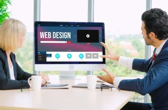
Think Smart, With Eye-Catching eCommerce Web Design
Sometimes, when we think about ecommerce web design, we’re so caught up in customer log-ins, shopping carts and payment gateways that we forget about the actual look and ‘feel’ of the site.
Whatever the purpose of your website, be it to inform, attract or sell, the design is still a key element – in fact, when you think about it, it’s THE key element, if you actually want to attract visitors!
So let’s set aside the technicalities for a moment, and consider some really smart ways of using good design to boost your sales.
Think Smart, With Eye-Catching eCommerce Web Design:
Choose a Professional:
The best way of doing this is to forget that you’re the business owner and, instead, imagine yourself to be the prospective customer. Think about the features that would attract you to visit the site, stay on the site and make a purchase.
And, unless you are actually trained in this discipline, I would suggest enlisting the help of a professional website design team on the Sunshine Coast!
The secret to good eCommerce web design as we move into 2017 is to keep it simple. However technical the back end of your site, ensure the site itself is clean, uncluttered, simple and stylish.
Improving Your Image:
And that starts with images. Remember, the whole point here is to give visitors to your website an enjoyable experience so that they not only make a purchase but also return to the site in the future AND tell their friends.
Faced with a mass of tiny images, too much text, a mix of fonts and a dozen different colors, what would you do? Leave the site, right?
Instead, work with one, full-page background image. Remember, you want to attract the customer, not distract them from shopping!
Sell the Dream:
Here’s the tricky bit; you must work with a high definition image for best results, but you don’t want your landing page to take forever to load. Professional web design on the Sunshine Coast knows how to make this work.
Your choice of image is important; it should represent your product or service, but also be attractive and enticing. Here’s an example: Let’s say you sell tyres. A full-page image of a tire would be pretty boring, right? But a picture of those tyres on a sports car, which happens to be zipping along a breathtakingly beautiful ocean road . . .
Remember, smart marketing is about selling a dream, a lifestyle, an emotion.
So, your visitor has arrived on site, and your stunning opening image is holding them there for the moment. What next?
Keep it Simple:
It’s time to consider the overall look of your ecommerce web design now and surprise, the advice is once again, keep it simple. It’s actually quite amusing. Website designers used to show off their skills by using every gadget and gizmo going; now the sign of a top designer is using a minimalist flat design.
Flat design became very big in 2016 and this trend will continue as we move into 2017. Flat design is pure design; simple lines, plain fonts, and limited primary colors. The reason it is called ‘flat’ design is that it has moved away from the 3D effect of using drop shadows and textures.
Remember, there is a science to choosing your website colors – it’s not a random pick! Certain colors stir up certain emotions, so be sure you’re sending the right message to your prospective customers!
Easy Navigation is King:
Looking at another ecommerce web design, you may have come across something we call ‘card design’. This is where each product effectively has its own ‘card’ – a space that contains an image and some text, along with navigation to the next stage.
Ah, navigation! That’s where so many ecommerce sites get it wrong! Put yourself back in your customer’s shoes. You want to buy a product as quickly and easily as possible, right? With minimal navigation.
This is the point where I, personally, have exited websites, even though I really wanted the product! I just want to make my choice, fill in my personal details, choose a payment method and hit go. I do not want to answer dozens of questions, or fill in surveys, or be sent to look at similar products. And I hate popups!
Keep the navigation simple and clear, using minimalist buttons that suit your super modern flat design.
Surely You’re Mobile-friendly:
Now, here’s the thing; even with your trendy design and stunning images and easy navigation, it’s all a waste of time if your website is not mobile-friendly. I can’t actually believe I’m saying this, seeing as we’re moving into 2017 and surely, every website is optimized for mobile by now!
But I will keep saying it because it’s THE most important thing you can do to have a successful ecommerce website. More than half of your target audience search on a mobile device. They shop on their way to work on the train; they shop during their coffee and lunch breaks, and they shop while relaxing on the couch at night.
Make it easy and enjoyable for those people to shop on your website, and you’ll be the winner!
Read also: