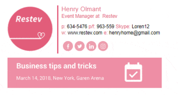
All businesspeople use email for correspondence. This channel of communication is fast and convenient. However, not many of us know and use its full potential. You can use email for many purposes. One of them is promotion and attraction customers.
If you still don’t use this tool to generate more traffic, we have a tip for you. Every email you send can be an additional opportunity for attracting visitors to your website or blog. How? There are several tactics, but here we will talk about the simplest and yet most effective one.
How To Design An Appealing Signature For Email?
A good email signature for business is concise. It usually consists of several lines that share the basic information about the sender, products, services.
The goal of this tool is not just to share your job title and contact details. Also, it is not just an appealing picture used to make your messages look good. Its goals are much more extensive.
An email signature should work for your benefit. It is a small text that can sell. Thus, your task is to fill it with the right information and then it will turn into a useful marketing tool. How to do it? The wisest way is to use a well-known marketing strategy AIDA (Attention, Interest, Desire, Action). You have to provide information that will be interesting for your customers and beneficial for you. Then add a call to action.
Here are more tips on how to design a great email signature:
1. Choose a neat design:
A well-designed signature will present your information in the most readable form. Make sure the chosen design matches your company’s style. Also, create a clear hierarchy that highlights the most important details.

2. Use colors that match:
It is a good idea to add a little color to your signature. Colors will add it individuality and make you stand out. However, make sure the chosen colors match and look organic.

3. Be careful with animations:
GIF signatures are quite popular today. However, they should be used only where appropriate. Don’t forget that such animations are often reproduced incorrectly and add weight to your messages.
4. Add a company’s logo or photo:
Your photo will show a real person behind the company. This is good as it increases the trust of your customers. If you add a company’s logo, this will help improve brand awareness. Don’t forget to ensure that a picture looks good on different devices and is displayed correctly.
5. Provide your accounts in social networks:
This is a good practice both for business and individuals. In both cases, it allows you to gain more followers and tell the recipients a bit more about yourself.
Tip: use icons instead of text. Icons look better and more organic. Besides, they are easily recognizable.
6. Use delimiters:
It is an excellent way to make the text more readable. With the help of delimiters, you can organize and structure the text correctly.
7. Call to action:
It is an excellent addition to your email signature. It should be simple, relevant and unobtrusive. A call to action may offer the recipient to subscribe to your blog, visit a website, attend your presentation, etc. It should be updated regularly depending on your current goals.

8. Mobile devices:
Recent research states that over 50% of emails are opened on mobile devices. The chances are that at least half of your target audience also use smartphones when reading your messages. Thus, you should pay particular attention to creating a mobile-friendly signature.
What Not To Include In Your Email Signature?
- Too much information. The email signature is a concise addition, not a flashy handout.
- Links to personal accounts on social networks that may negatively reflect on your reputation.
- Home address and telephone. Unless, of course, you want to receive calls or visitors outside working hours.
- A vast number of contact options. It is better to keep it simple. Try to provide a maximum of three feedback options.
- Too complicated, bright or heavy for perception elements. This applies to fonts, images, animations, and other visuals. Too much is not always good!
Read Also:


