In the ever-evolving landscape of smartphones, a new player has emerged, catching the attention of tech enthusiasts and casual users alike. As intriguing as its name suggests, the Nothing Phone promises an exit from the conventional.
Even though Nothing Phone 2 is now out, a lot of you might want to try your hands in Nothing 1. In this article, I will examine whether the Nothing Phone could truly be the future of smartphones.
Nothing, a company founded by Carl Pei, known for his co-founding role at OnePlus, has ventured into the smartphone realm with a device that aims to redefine our expectations. The Nothing Phone sparks curiosity right from its name, which deepens as I delve into its features.
If you are someone who has come across the name of this particular phone a lot of times but is skeptical about choosing it, this blog is for you! So, keep reading this article until the end to learn more about the same…
Nothing Phone Specifications
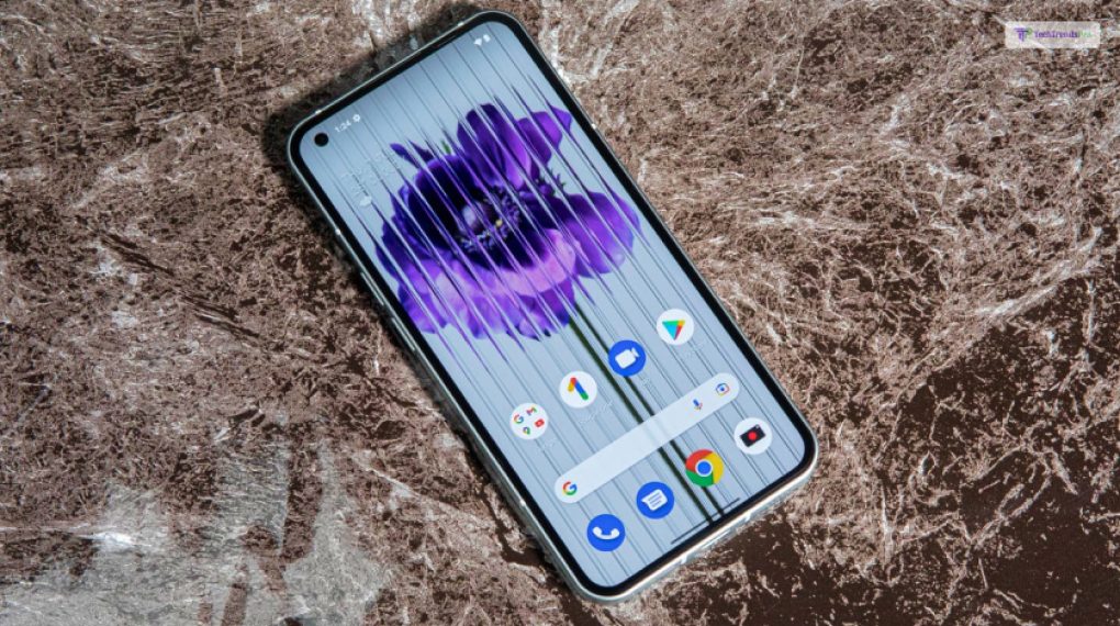
| Brand | Nothing |
| Network | GSM, HSPA, LTE, 5G |
| Dimensions | 159.2 x 75.8 x 8.3 mm (6.27 x 2.98 x 0.33 in) |
| Build | Aluminum frame, Glass front & back (Gorilla Glass 5) |
| SIM | Dual (Nano-SIM, dual stand-by) |
| Display | 6.55 inches, OLED |
| Resolution | 1080 x 2400 pixels |
| Operating System | Android 12 (upgradable to Android 13, Nothing OS 2.0)Qualcomm SM7325-AE Snapdragon 778G+ 5G |
| Memory | 128GB 8GB RAM, 256GB 8GB RAM, 256GB 12GB RAM |
| Camera | 50 MP (wide), 50 MP(ultra-wide), 16 MP (front camera) |
| Sensor | Fingerprint |
| Battery | 4500 mAh |
The Genesis Of Nothing
The Nothing Phone 1 keeps things refreshingly simple despite its big-name backing. Since its inception in late 2020, Nothing has championed straightforward, open technology.
The Phone 1 carries this ethos forward, maintaining the eye-catching design, capable features, and an affordable sub-$500 price tag we saw with the Ear 1.
Don’t expect a groundbreaking premium device; the Phone 1 is a mid-range marvel. Its bold appearance might make you think it’s packing a punch, but the specs and the price tell a different story.
Comparisons to OnePlus are unavoidable, but the Phone 1 aligns more with the clean and lean OnePlus Nord than the brand’s previous “flagship killers.” With no shackles from the mysterious BBK conglomerate, this is the purest form of the Nord vision.
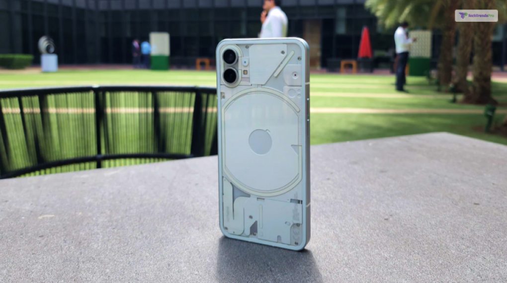
The most noticeable departure from its predecessor is its look. Every aspect of the Nothing Phone 1 screams individuality, from the handset’s striking appearance to its slim box down to the oddly extravagant transparent pill handle on the SIM ejector tool.
The only letdown? The dull white USB-C cable. For a bit of flair, you’ll need to shell out for Nothing’s separate 45W charger with its see-through cover atop a basic white brick.
But let’s focus on the star of the show— the phone itself. With its transparent rear glass, faux components, meticulously placed panels and screws, iPhone-like form factor, and the centerpiece Glyph— a quartet (or quintet if you count the bottom dot) of pulsing rear lights powered by hundreds of LEDs. It’s a visual feast that sets the Nothing Phone 1 apart in a sea of smartphones.
Let us take a deeper look at the features of the Nothing phone, shall we?
Sleek Design, Minimalist Marvel
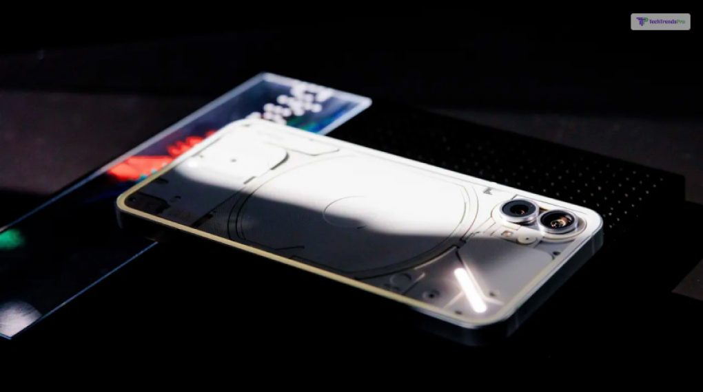
At first glance, the Nothing Phone stands out with its minimalist design. The absence of unnecessary frills and the emphasis on clean lines echo the ethos of the company.
The device is a sleek slab of glass and metal, exuding an air of sophistication. Its simplicity is a breath of fresh air in an era dominated by overcomplicated designs.
Transparent Disruption: Literally
One of the standout features of the Nothing Phone is its transparent body. Yes, you read it right – transparent.
This bold design choice sets it apart and gives users a unique visual experience, showcasing the intricate internal components. It’s a transparent disruption in a market saturated with uniformity.
Glyphs: A Notification Or Something?
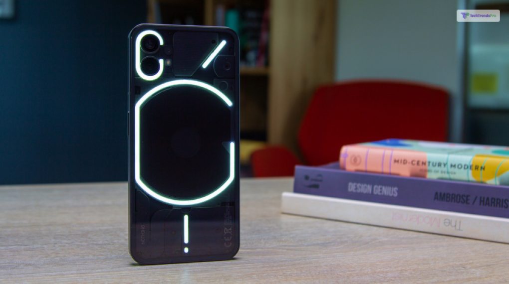
The most striking aspect of the Phone 1 is its light strips, which flicker in patterns known as “glyphs” by the manufacturer.
There are a total of 20 glyphs in two groups, 10 for notifications and 10 for ringtones, each linked to an associated sound.
You can turn on lights only for silent alerts or sounds only for notifications without lights, but you can’t alter the tone that each glyph is associated with.
Broadly speaking, you can configure a glyph to appear in all incoming alerts and all calls and stop there. Alternatively, you can dig further into the specific settings of each app.
According to the Verge, “You can set a glyph for any app notification that lets you assign a custom notification sound — one glyph for work emails and a different one for personal emails, for example, or separate glyphs for Instagram likes and comments.”
Beyond The Surface: What Lies Inside?
The transparency isn’t just for show. The Nothing Phone boasts cutting-edge hardware under the hood. Powered by the latest processor and coupled with ample RAM, it promises seamless performance. The camera setup, though minimalist, delivers stunning shots, emphasizing quality over quantity.
Operating System Of Nothing
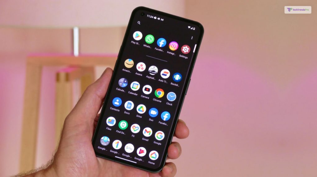
Nothing takes a bold stance on software, aiming to ditch the complexity seen in many Android skins today. Their approach revolves around a few core principles: smooth operation, consistency, a bloatware-free experience, and compatibility with third-party products. This move echoes the simplicity that made early OnePlus models stand out.
As per other sources, the software outcome is a rendition of Android 13 (though the phone ships with Android 12 initially), embracing clinical simplicity but occasionally bordering on outright minimalism. With only four exceptions, every pre-loaded app is a Google app, covering essentials like the Phone app and the file manager (Files).
The exceptions include the Camera app (more on that in the camera review), a Weather app, a Recorder app, and the Nothing X app facilitating connections to other Nothing products like the Ear 1, Ear 2, or the Ear Stick.
The Recorder app, with its charming tape-like aesthetic, lacks the advanced voice transcription found in the superior Google Pixel Recorder. However, it excels in isolating voices from background noise, a feature worth noting.
The overall user interface (UI) follows suit with its spartan approach. The notification tray houses six quick settings, deviating from the standard four. A second swipe down reveals two large circles, one for networking controls on the left and device connections on the right.
These circles offer additional controls when swiped horizontally – for instance, toggling between mobile data, Wi-Fi, and hotspot settings, with long-press actions leading directly to the corresponding Settings menu.
In embracing simplicity, Nothing’s software strategy leans towards the nostalgia of straightforward functionality. Whether this minimalist approach resonates with users remains to be seen, but it undeniably sets the Nothing Phone apart in a market saturated with feature-heavy interfaces.
Connectivity Reinvented
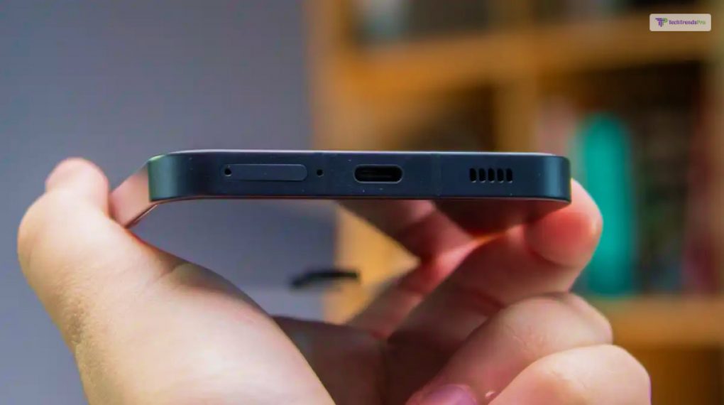
The Nothing Phone redefines connectivity with its innovative approach. Integrating advanced wireless technology ensures swift data transfer and a lag-free connection. When it comes to messaging, you will be glad to know that it also supports RCS. *phew*
The device seamlessly syncs with other smart gadgets, providing a cohesive user experience that extends beyond the phone itself.
Gaming Nirvana: A Gamer’s Delight
For gaming enthusiasts, the Nothing Phone is a delight. The high refresh rate display and responsive touch controls elevate the gaming experience to new heights. This is a great phone, even if you are playing card games.
The active cooling system ensures that the device remains cool even during extended gaming sessions, allowing for uninterrupted gameplay.
Sustainable Tech: A Green Commitment
In an era where environmental consciousness is paramount, the Nothing Phone stands out for its commitment to sustainability.
The materials used in its construction are eco-friendly, and the company has implemented a recycling program aiming to reduce electronic waste. It’s a step towards a greener, more responsible tech industry.
My Verdict: Is It The Phone That We Need?
As I dissect the features and innovations of the Nothing Phone, the question arises: is this the future of smartphones?
I believe the answer lies in its seamless integration of cutting-edge technology, user-centric design, and a commitment to sustainability.
It’s not just a smartphone; it’s a glimpse into the future of how we interact with our devices.
In conclusion, the Nothing Phone challenges the status quo of smartphone design and functionality. Its transparent body symbolizes the company’s commitment to transparency in both design and operation.
With user-friendly features, a focus on sustainability, and a gaming experience that excites the Nothing Phone, it is more than a device; it’s a statement.
As we navigate the ever-changing landscape of technology, the Nothing Phone invites us to embrace a future where innovation meets simplicity. It’s a bold step forward; only time will reveal if other tech giants follow suit. For now, the Nothing Phone stands as a beacon, inviting us to expect more, experience more, and, ultimately, embrace the nothingness that signifies endless possibilities.
Read Also:


