Verizon is one of the oldest and most well-renowned telecommunications companies in the USA. Since its inception in 1983 and its rebranding in 2000, the Verizon logo has changed a total of four times.
Since the logo of a company is the face of an organization, it’s important to look at how logos are made and what they signify. Therefore, read this article till the end to learn more about the logo of Verizon.
Verizon Wireless Logo: What Does It Mean?
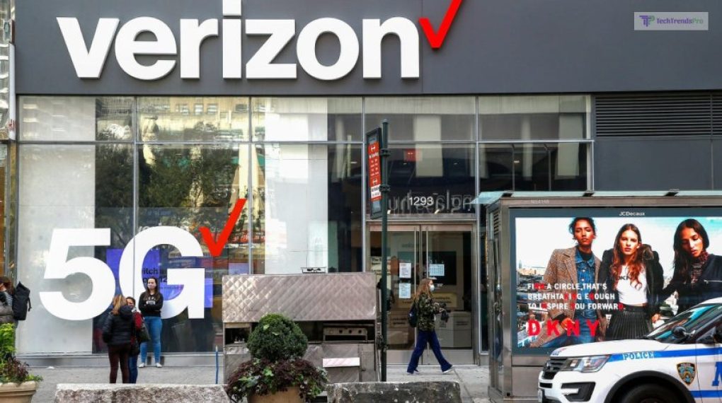
Since its inception in the 2000s, the Verizon Logo has been pretty recognizable everywhere in the USA. This is because of the unique check mark on the top of the logo. This checkmark is one of the catchiest and easily recognizable aspects of the transparent Verizon logo.
According to moist Verizon spokespersons, this checkmark stands for a notion of approval. In other words, it means that Verizon provides the best services to its customers, and the customers are also happy with it. This is why they place their trust in Verizon and its services to be the best.
Read More: Which Social Media App Has A Ghost As Its Mascot?
Verizon Logo Design
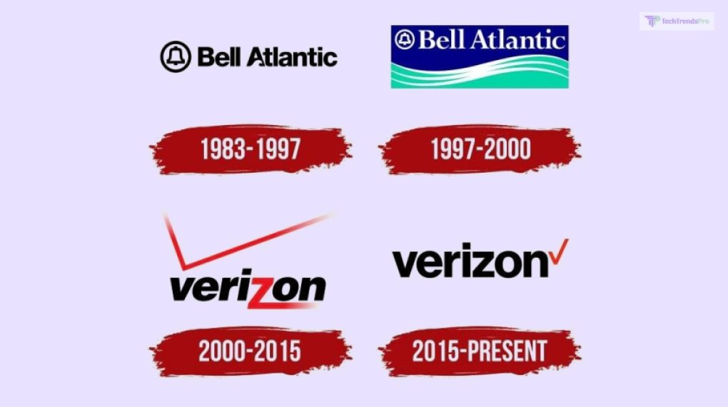
The design of the Verizon logo has changed considerably over the years. This company has been in existence for almost 40 years now. In this span of time, it has had its logo changed a total of three times so far. Let’s have a look at how the Verizon media logo has changed over the years.
Bell Atlantic Logo (1983 To 1997)
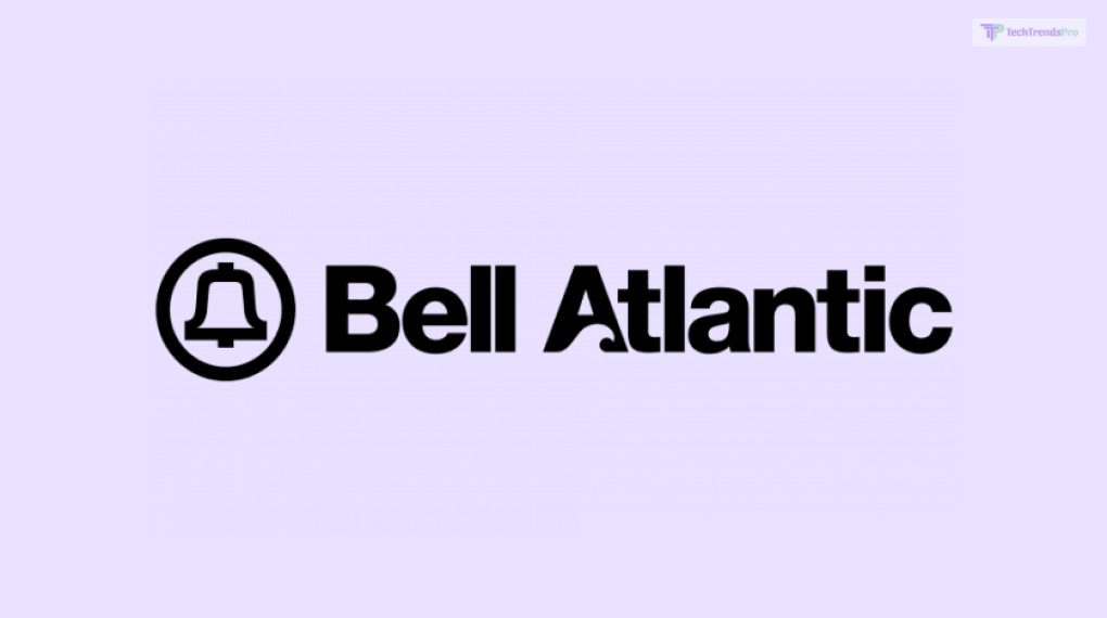
Did you know that Verizon was initially known as Bell Atlantic in the 1990s? When the company was first launched in 1983, the company was established as Bell Atlantic. During this period, the company had a very simple logo. The main picture was that of a bell placed inside a circle. This was accompanied by the brand name.
However, if you look closely at this logo, you will find that the letter A of Atlantic looks different. This is because there is a wave-like shape at the bottom of the letter. This wave represents the ocean and the seas, accentuated by the use of the word Atlantic – an ocean.
The connection to the seas was made to emphasize the fact that the network range of Bell Atlantic crosses oceans. While it does not, it’s a smart but subtle hint to denote the long range of Bell Atlantic’s network.
Revised Bell Atlantic Logo (1997 To 2000)
Bell Atlantic changed its logo for the first time in 1997. Here, instead of the minimalistic logo that it originally had, it now comprises a wave underneath it. Therefore, the text and the bell logo have remained the same, with the addition of the blue wave underneath it. Here, you will see that the wave from before in the letter A has been removed completely.
Also, more emphasis has been placed on the Atlantic word. Since it’s an ocean, the waves underneath the wordmark are colored in shades of light and dark blue. This denotes the ocean more clearly than before. Also, the letters have the same font type as the previous one – Sans Serif.
Original Verizon Logo (2000 to 2015)
When Bell Atlantic changed its name to Verizon Communications in 2000, it changed its logo again. This was expected since the name of the company had changed. This design was created by the design firm Landor Associates from San Francisco.
Here, we see that the word “Verizon” appears in all lowercase letters. In addition, the “z” in Verizon is red in color and appears to be extended at the bottom. The tail end of the letter Z is extended and fades away near “n” – the last letter. All the other letters are in black and are also Italicized. It’s also designed using the Helvetica font type.
In addition, there is the signature tick mark or checkmark at the top. This checkmark is pretty big, starting from V and ending at N. It’s also red in color, just like the letter Z.
Revised Verizon Logo (2015 to present)
The new Verizon logo png was developed by Pentagram. This logo appears as sort of a revamp of the older logo and not a complete overhaul.
One of the most noticeable changes here is the minimalistic approach of this logo. Here, the check mark has been made smaller. Now, it’s only a small tick mark at the end of “n” – the last letter. In addition, the letter is no longer Italicized. It’s also designed using the Neue Haas Grotesk font type. Also, the letter Z is no longer in red.
Once, Micheal Bierut, one of the senior designers of Pentagram, was questioned about the idea behind this new logo. He stated that it was remade to follow a minimalistic approach and reduce “visual noise,” making it less flashy. This made the logo cleaner and simpler, according to modern logo design standards.
Read More: How To Download And Use The Latest Version Of Tlauncher For Android For Free?
FAQs (Frequently Asked Questions):
Many users (especially graphic designers and Verizon users) have asked various questions regarding the Verizon logo. Here, I have answered some of their questions.
Ans: The Verizon check mark on the logo is a sign of trust and approval, according to company officials. This mark inspires trust in the firm from its customer base comprising millions of users.
Ans: The Verizon slogan has changed a lot over time. In the early 2000s, when the company was established, it was “Can you hear me now?…. Good!” It was then changed to “We never stop working for you.” Right now, with the advent of 5G technology in 2022, it has changed its slogan again to “5G Built Right.”
Ans: Verizon Wireless provides various cellular networks to millions of users in the USA. Being one of the oldest companies providing cellular networks, it’s famous for providing good services. In addition, it’s also the first company to introduce 5G connectivity in the USA – something that it’s currently focusing on.
Conclusion
The Verizon logo has changed over the course of its four decades of existence a total of four times. First, it started out as Bell Atlantic in 1983. Then, it changed its logo in 1997. After three years, it was rebranded to Verizon, with a new logo to boot. However, it was changed again in 2015 to follow a more modern, minimalist design.
Read Also:


