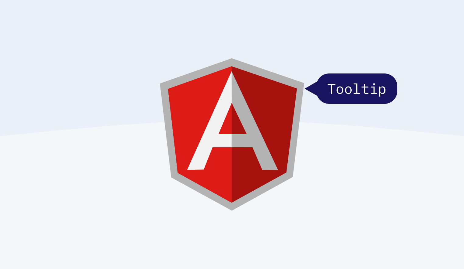
The Angular Tooltip component is a pop-up that displays a message or information when a user hovers over, clicks, or touches a button, anchor, image, etc.
Such a message can show simple text, images, custom templates, or hyperlinks.
The tool can be used to create nice-looking tooltips that present hints or information.
What Are The Angular Tooltip Components?
The angular tooltip component is a popup that shows all short information or messages when users hover over them. Certain kinds of cations all come under the components. These components are click, focus on, touch, and image-showing options along with the buttons and anchor tags.
The tooltip gives a brief and informative message that appears on the user interaction, which also has some of the elements in the graphical user interfaces. The mouse hover gesture or a keyboard hover gesture gives all these components.
Why Use Angular Tooltip Components?
Angular Tooltip is one of the Angular pre-built components that make it easier to create attractive, user-friendly websites and applications. It provides labels displayed when the user interacts with an element.
It can be displayed above, below, left, or right of the element – by default, it will be immediately shown when the user’s mouse hovers over the tooltip’s trigger element and instantly hides when the mouse leaves.
On mobile, it’s displayed when the user long presses the element and hides after a certain delay. An important rule is always to ensure that keyboard users can perform the same set of actions available to mouse and touch users.
The angular material tooltips provide the text label, which is going to display when the users hover over or for the long press of elements.
How To Use The Angular Tooltip Component Step By Step?
As Microsoft says, the tooltips are referred to as screen tips. They are called tooltips; hence they are usually implemented to provide all the contextual and other usage information. By using various tools, the applications are achieving lengthy consult manuals with other documentation.
First time with the Angular Tooltip tool? No worries, below you will find some handy tips on how to start step by step:
- Set up Angular Environment and create an Angular application.
- Set up and configure Angular Tooltip – you need to create a new project and add the Angular material library.
- Then, you should import the MatTooltipModule to your project. You can import the module within your components of ts file or app.module.ts file. Without this module, you cannot use the component.
- Add CSS reference (component’s styles).
- Finally, you should add the matTooltip directive to create a tooltip in the component template. Use the mat Tooltip selector to display tooltips and set the mat of the tooltip Position by using the matTooltipPosition. By default, tooltips will be displayed below the element, but you can change the position.
- Important information: matTooltip selector is necessary to display the tooltip when the user hovers over an element.
- Create an actual tooltip component with simple and basic styles, which provides a way for the tooltip to consume coordinates.
- Pull the coordination from the parent component and pull the data from the parent component.
- Show data on hover and add conditions for the tooltip and for an ellipsis.
- That’s it!
Key Takeaways
Tooltips are an essential part of many UIs. They provide important information that icons cannot, and they are a perfect way to keep a UI clean yet still usable.
During the long press of the hover, the Tooltip is going to show, and I think you already get the ideas about the actual functions of the tooltips.
They help you describe what a button will do to a user who is unfamiliar with your interface. If you want to share anything more about the subject topic, you can use the comment sections.
Additional:

