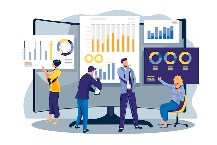
Data visualization is simply the discipline of presenting data and information in creative, understandable, and visually appealing ways.
Some examples of this include infographics, area charts, bubble clouds, cartograms, dot distribution maps, heat maps, matrix, and many others.
Data visualization is the future of creating content for healthcare, especially because of the following reasons:
- Helping medical staff understand and interpret the results of data analytics much faster
- Allowing primary care providers to make better decisions for their patients
- Allowing decision-makers to recognize trends in clearer and simpler ways
While they may have already used home care software, or something pertaining to their industry, effectively to help them manage staff and help the business run as efficiently as possible, healthcare practitioners, brands, and business owners need to master the art of data visualization for the highest good of their patients and clients, now more than ever. Here are some ways healthcare brands can maximize this tool.
1. As a digital marketing tool
Because healthcare entrepreneurs and medical professionals are not always the most adept at marketing and the most up-to-the-minute tools, may not always have the wherewithal to understand how data visualization can help them achieve their goals and reach more patients.
For this reason, partnering with a marketing team that specializes in the healthcare brand’s specific industry might be most ideal.
For example, a home care marketing company might be a care facility’s best because this team of professionals would know how to create visual data that would not only appeal to potential patients but would also help them understand why your specific healthcare brand is the one they need to trust.
Here are some ways data visualization can work as an effective tool for marketing:
- It’s a way to make an otherwise boring topic so much more engaging. For example, medical reports and research might not be the most exciting thing to read about, but with a well-designed infographic, potential customers and patients might be more inclined to stay on the website.
- Visualized data can help healthcare brands reinforce an opinion or argument, convincing patients to check out their products or service.
If you want to draw more people to your brand or facility, partnering with marketing professionals who can help you fully maximize data visualization as a tool is a worthy investment.
2. As a way to see patient data all from one place
Interactive dashboards can help medical professionals and staff to see all of their patients’ medical history all from one organized place.
These dashboards are often operational since they display data in real-time, analytics for more advanced and accurate analytics, and strategic so that they display trends and patterns as time goes on.
For example, if a clinic still has physical files for their patient records, it’s time to upgrade everything to digital. And not just digital-these more advanced tools can help automate information and update data as things change.
So if healthcare brands and facilities want a more organized approach to filing their patients’ information, data visualization is crucial.
3. As a powerful tool for disseminating complex information
If one of the healthcare brand’s missions is to provide people with accurate information about ways to care for their health, then visualized data is key.
It’s one thing to present statistics and numbers in paragraph form, but it’s another thing to display them using a colorful and easy-to-read pie chart.
One example of a healthcare institution that is doing a wonderful job at this is John Hopkins University, which often uses infographics to provide critical information and data about different kinds of diseases.
They also give their audiences some evidence-based recommendations for preventing the development of the disease.
Data visualization in healthcare allows laymen to view otherwise complex information in a more simplified format, resulting in higher engagement, better understanding, and more chances of people choosing a healthcare brand over their competitors.
4. As a tool for detecting error and fraud
Experts say the yearly average cost of abuse and fraud in Medicare alone can range from $58 to $83 billion. Some fraudulent schemes involve activities like phantom or double billing, sending multiple bills for a single service, insurance cheating, forged prescriptions, and many others.
Data visualization can help provide much-needed transparency and accountability for all sides-for practitioners, care providers, patients, claims, and payers.
And with the added help of AI technologies and machine learning, data visualization can help all stakeholders avoid messes and errors since anomalies and potential fraud can be detected quickly and automatically.
Healthcare brands, facilities, and businesses need to invest in data visualization if they want to be ahead of the game and to provide their patients and stakeholders with the best possible care. It’s a worthy investment and one that will be standard for generations to come.
Read Also:


