
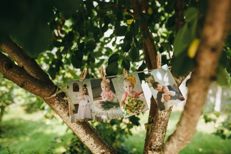
Nowadays, almost everyone has a high-resolution camera, including smartphones, DSLRs, and more. People love to take photos of everything they love such as famous monuments, beaches, birthday parties, and more.
Most people consider taking prints of their images to store them in a special way. Sometimes, when you print your photos, they don’t look the way you expected, or you see them on screen. The reason behind this is the lack of understanding to make perfect photo prints.
Here are a few tips for you to take correct photo prints.
Set the brightness of the monitor:
Often, when you take prints of your image, they look dark. The main reason for this is the brightness level of your computer screen is too high. So, when you see an image on the screen, you like it, but when you take its print, you find it darker than what you have seen on the monitor.
Further, bright monitors influence your editing adjustments as you can see things clearly on them. So, the simplest solution to dark prints is to reduce the brightness level of the monitor. After this, adjust the brightness of the photo before taking its printout.
Set the correct color profile:
If you’re a photographer, then you’ve probably experienced a moment when you realized that the print of an image did not look the way you expected. This can happen with business cards, brochures, customized prints, and more.
This is where you need to set the color profile of the image on the monitor before taking out the print. Following are the types of color profiles that you need to focus on.
RGB color profile:
When you see an image on a digital device, the ideal color profile should be RGB. It has the widest range of color possibilities, so it is your best choice for designing graphics as well.
CYMK profile:
When you design for a printed format, the CMYK profile is the best color profile for you. In this, the base colors are cyan, magenta, yellow, and black. This color profile is best for any kind of digital or offsets printing.
Pantone profile:
The Pantone Profile is the best option to highlight specific colors in your print. This color profile is useful for offset printing for something like a logo or letterhead.
Use quality print paper:
If you are using poor-quality print paper, then your prints will never look good. So, for creating high-quality prints similar to https://www.elephantstock.com, you need to use quality printing paper. The quality of the material you use makes a huge difference to both the appearance of your prints and how long they last.
How to Get Better Prints?
So above are some ways through which you can make a correct print. To dodge all the pitfalls:
- Use high-quality image files.
- Make sure the monitor isn’t too bright or too saturated.
- Try to calibrate your monitor.
- Follow the proper color profile.
- Get a good printer to print quality images.